Be Harmonious.
When you decide it’s time to decorate your home, keep in mind what style you’re going for and what you want to achieve with this room or area. Life is all about making it what you love. So why not love your space you’re in too?
When decorating or putting a piece into an area, try to find things that work together really well. For example, you want to match your couch to your 70’s vibe, then maybe look into something that stands out and will catch your whimsical taste. Add some bright, sunny pillows to really bring in the era!
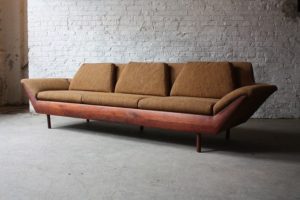
(the Flexsteel Thunderbird, can find this piece at your local Plymouth Furniture)
Another important thing to remember about design is that there are no limits to what you can do. Increase any expectation of what someone may have expected to see in a room. Design is ABSTRACT, symbolic, cross-cultural and can break cultural barriers. Make the space usable and also memorable.
” the objects must communicate with one another, respond and balance on another ”
— Audree Putman
Good design is a conversation!